We’re Problem Solvers, and we use our favorite low-code tool (FileMaker) to build tailor-made solutions for our customers. We aim to optimize and facilitate business processes by automating tasks that produce data; this raw data reflects company activity. Our customers can analyze this data to get an accurate overview of their business activities and make informed decisions.
The problem is that the data is unreadable in its current state, and needs to be reworked, grouped, and selected to extract relevant information. This is why our customers often request statistics or a dashboard.
To process information, by definition, it has to exist (we won’t hesitate to open as many doors as necessary in this article), and creating a dashboard can be a time-consuming process. Here’s why dashboarding can be overlooked in our projects, due to lack of budget.
As we list the available methods, we’ll see that one method has a number of significant advantages, and disadvantages which can be overcome.
Let’s imagine we have a solution that produces invoices in a table:
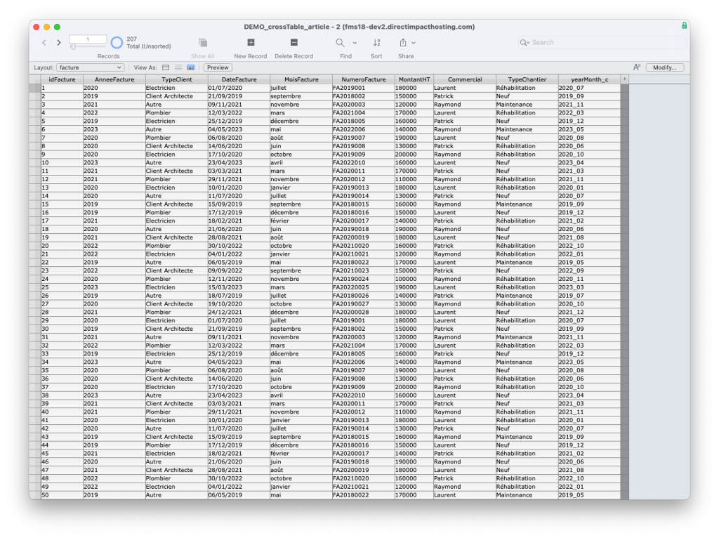
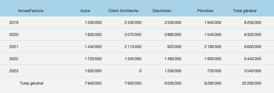
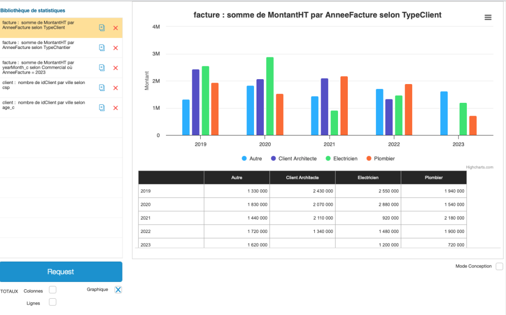
Imagine that our customer asks us, quite legitimately, how much they have invoiced per year since installing their software in 2019.
1. Discourse on Methods
Without claiming to be exhaustive, we could classify the possible methods into four categories: Excel exports, the use of sub-summaries in reports, more complex methods, and the creation of an HTML table.
A. Excel Export
A popular method with Excel lovers, who will immediately realize that an export is possible on the platform they’ve mastered, exporting is a fairly quick and inexpensive way of producing a pivot table that meets our needs in just a few minutes.
The main disadvantage, however, is not insignificant: we’re out of FileMaker, working locally on our unshared table, and the slightest data modification means we have to systematically redo the same operations. Taylorism being a thing of the past, we’ll remind our customer that time is precious, and consider other methods.
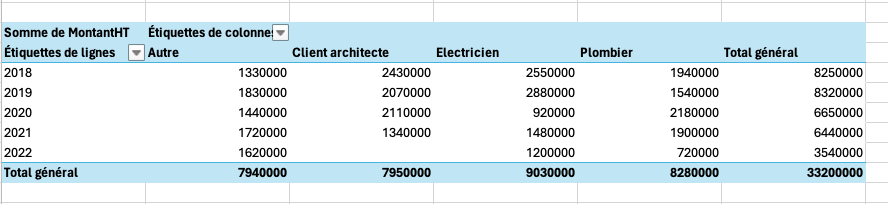
B. Sub-Summaries After Sorting
This model object, with its unlikely name, can be very powerful. It can be created using a wizard, or by manually insertion into a list. FileMaker makes it easy to create a lot of reports, which is probably why I’ve devoted my career to it, but it also allows us to create our pivot table in a new template.
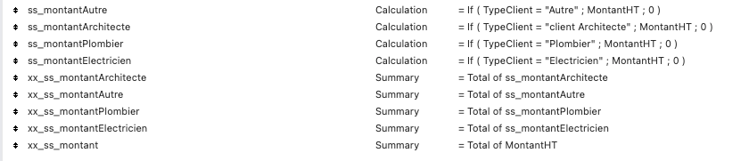
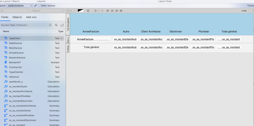
By creating a few additional headings, we can claim to have the same table, updated with a single click, without leaving FileMaker. Progress is underway. Can we do better?
C. More Complex Solutions
Other techniques can be used to aggregate information.
We could use a pivot table to calculate, in our example, only the five years required. This would involve replacing statistical headings with calculations using the sum function. One advantage is that we externalize calculations from the original table, and, if necessary, group data from several tables into a single table. The major drawbacks of this method are performance loss and the need to add a table in addition to the necessary fields.
We could also imagine a “virtual list,” which would include (in a table) a list created from scratch, probably by script or SQL calculation. In the final analysis, this method is similar to the following technique, but less lighthearted, since here, too, we need to create a table to display our “virtual list.”
D. The HTML Table
As long as we’re building a text file that aggregates data, why not imagine a script that:
- Loops through invoices to collect data in a more practical and universal format than a simple list: a JSON object
- Loops through this same object to build an HTML code with a table displaying the desired result
- Displays this code in a web viewer, whose primary function is to do just that
Admittedly, this solution is more complex in practice, but it does have one major advantage: portability. There is no need to create template objects (apart from a simple web viewer), headings or tables—everything is created by script.
In a way, this led me to realize that although everything else was simplified, the script in question could easily reach 200 lines. Schematically, 100 lines to aggregate the data into a variable and 100 lines to transform this variable into an HTML table. If the statistic in question needed to be modified a little, it was a matter of modifying a lot of lines in the right places. As wise men had warned, did freedom come at a price?
2. The Improved Method
How can we improve our method to keep only its redemptive qualities?
A. Grouping Data
Let’s note that the Execute SQL calculation function not only allows us to free ourselves from context, but in addition, when enriched with a “GROUP BY” statement, automatically aggregates the data according to our wishes. For our example, this calculation:
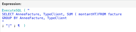
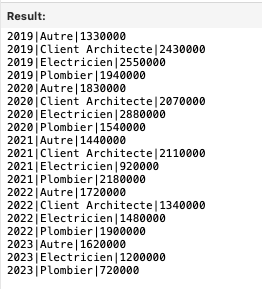
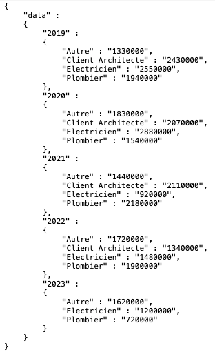
Will give us this list:
B. Sorting Data
We can now arrange our data into a nice, solid JSON object. The more attentive, or at least those who have reached this stage of this brilliant presentation, will ask: “Why go through a JSON object?”
Since all roads lead to Rome, this step isn’t necessary, but it does allow us to standardize our data, handle null values more easily (have you noticed that there are no Architect invoices in 2023?), add totals, etc.
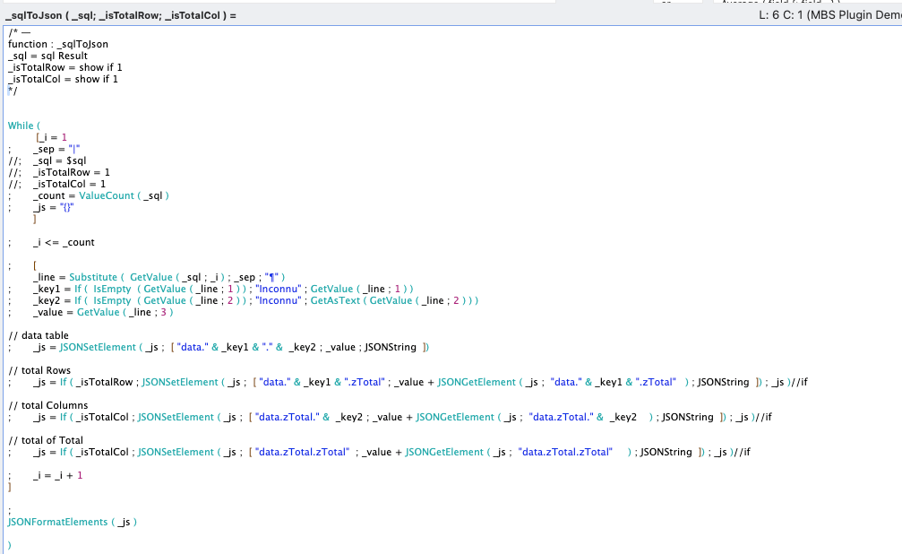
To save on script loops, why not imagine a calculation function to loop through the list and build this object?
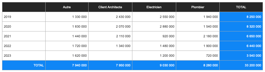
The result of our query would then look like this:
C. Displaying the Data
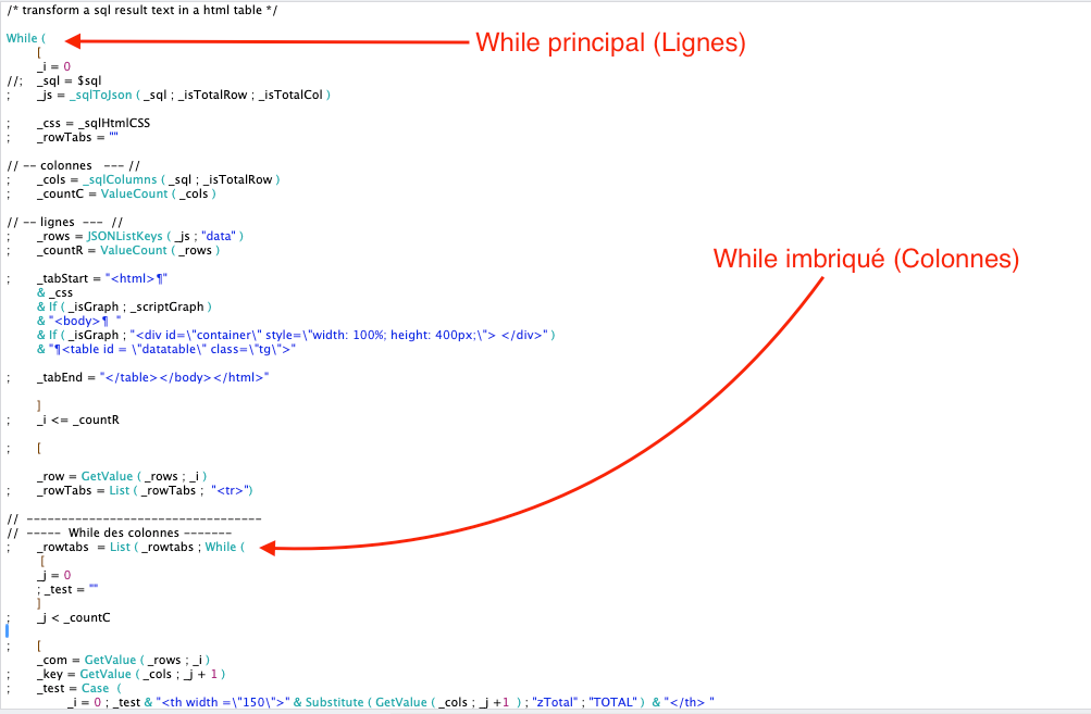
Having stored our data in the most standard format available, we now want to create an HTML table to display the data. Our custom function _sqlToHTML, in charge of transforming the result of an SQL query into an HTML table, will:
- Call several secondary functions
- Loop through the JSON result to create table rows and loop through each row to create each cell. “While” loops can be nested, much to our delight!
The general operation can be summarized as follows:

Note the use of other custom functions:
- sqlHtmlCSS: simply externalizes our CSS code
- sqlColumns: browses the JSON results to list all the columns required
- scriptGraph: we’ll look at later
By simply inserting our SQL query directly into our web viewer and applying our custom function:
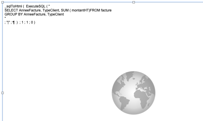
When the web viewer is displayed, the result is:
All this is possible with just a few custom functions. Portability is maximized, as all we need to do is copy a set of custom functions and call just one (which contains all the others) in our web viewer.
3. The Ultimate Method
A. Room for Improvement?
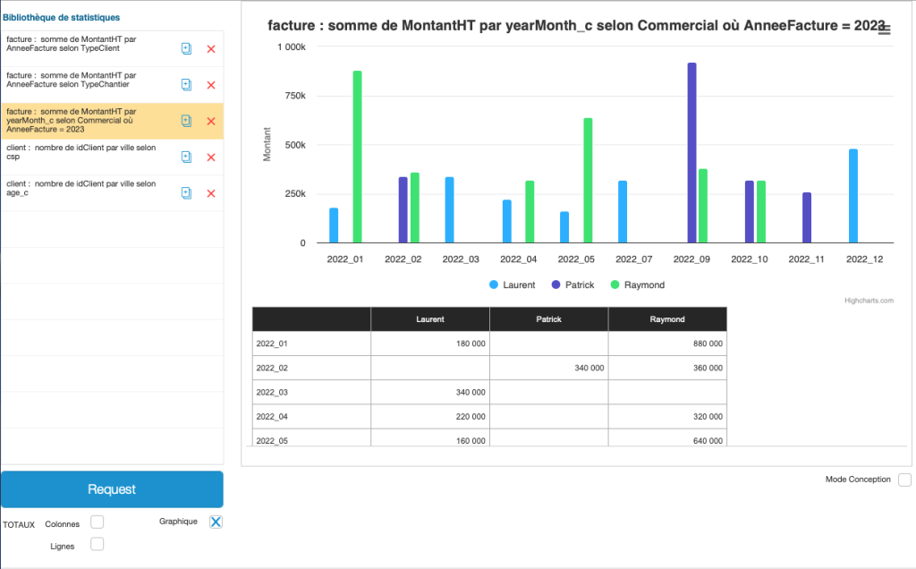
Let’s not suffer from excessive perfectionism, but let’s look at the few remaining limitations. We now have a table of statistics generated automatically by entering an SQL query in a web viewer, and therefore the desire to multiply the various tables. (Why not calculate sales by type of job, or monthly sales of salespeople by month in 2023?)
Using this method would require us to multiply web viewers and, therefore, display models.
By integrating the SQL query directly into the web viewer, we also need to know the SQL and the names of the tables and fields.
We’ve extolled the idea of maximum portability, which avoids the need to create tables and fields, but if we sacrifice ourselves to this dogma, we could imagine creating a table and fields that would allow us to:
- Create and save as many tables as required (one per record)
- Simply build an SQL query, opening up the possibility for our clients to create their own statistics
Let’s face it, the benefits are probably worth it.
B. What About Graphs?
Generating a graph as the visual representation of our query in FileMaker would probably require us to create fields, place the results of our various calculations in lists in an expected form, add additional custom functions, scripts, fields… goodbye simplicity!
We decided to display our results in a much more universal format, HTML. By adding suitable Javascript libraries to our code, we could imagine obtaining the graphics we want, and, with all due respect to Claris, probably more attractive and interactive.
Here we’ve chosen to integrate an extremely powerful tool that starts directly from the table we’ve generated: HighCharts. It’s a paid tool that justifies its price by its ease of implementation; you’ll find the pricing here: Buy Highcharts License | Highcharts Online Shop
In our example, all we need to do is name our chart and HighCharts does the rest!
Note that free libraries exist and could probably be used, starting from JSON with the data and not from the table directly, requiring, in this case, a new function to convert our query and obtain the desired format.
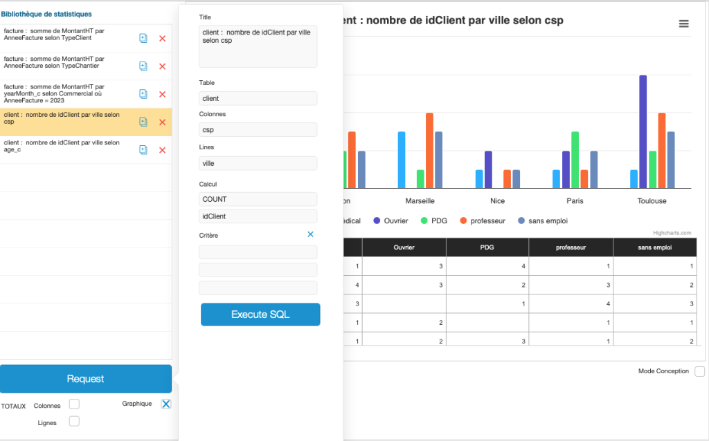
C. Why Use a Single Table for our Statistics?
As our method is based on an ExecuteSql calculation, it is independent of the sacrosanct FileMaker context, so we could consider obtaining summarized data from another table. For example, we could get data from the socio-professional category of our customers according to their city, or their age bracket.
Here are a few graphical examples:
Finally, this 12-minute video will show you how easy it is to implement this method in an existing solution (video is in French with available English subtitles under Settings > Subtitles > Auto-translate):
Conclusion
Creating tables and graphs on the same page, to provide our customers with the most relevant decision-making elements, certainly adds value to an effective solution. This component could require hours or even days of additional development to complete, and each new customer requirement brings its own complexities.
The combination of calculation functions, some of them not so recent, enables us to propose a way of doing things that is very easy to install on any FileMaker solution.
The method presented here doesn’t solve every problem, but it’s likely that 80+% of cases can be solved in just a few minutes. By leaving it up to our clients, we can even let them create their own statistics. There’s no doubt that our customers will be satisfied, and customer satisfaction is one of our core values at Direct Impact!